Long before a customer reads a label or checks a price tag, their brain has already formed an opinion. Display packaging triggers a cascade of psychological responses — colour, shape, texture, and placement all feed into a split-second judgement that determines whether a product gets picked up or passed over.
First impressions are formed in milliseconds
Research suggests that consumers form an initial impression of a product within 90 milliseconds of seeing it. That near-instant reaction is driven largely by visual stimuli, with colour alone accounting for up to 90% of that snap judgement. Brands that understand this invest heavily in packaging design not as an afterthought, but as a core part of their marketing strategy.
Colour shapes perception before logic kicks in
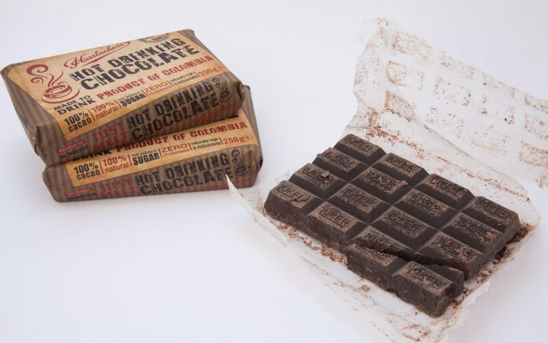
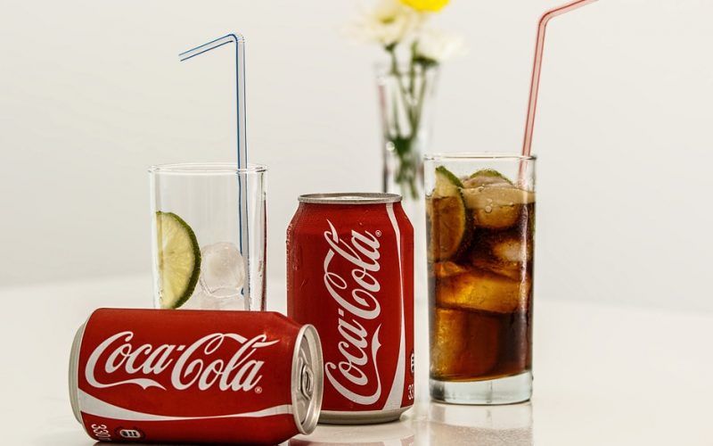
Colour psychology is one of the most powerful tools in a packaging designer's arsenal. Blue signals trust and reliability — which is why it dominates banking and healthcare. Red creates urgency and appetite stimulation, making it a staple in the food industry. Premium brands frequently lean on black, white, and gold to communicate exclusivity. These associations are deeply ingrained, often cultural, and remarkably consistent across consumer groups.
Shape and structure influence how we feel about a product
It is not just colour that shapes perception — physical form plays an equally important role. Angular, sharp-edged packaging tends to signal strength and precision, whilst softer, rounded forms feel more approachable and gentle. Luxury goods often use heavier packaging materials to trigger a psychological principle known as weight bias: the heavier something feels, the more valuable we perceive it to be. These cues operate largely below conscious awareness, yet they significantly influence purchasing decisions.
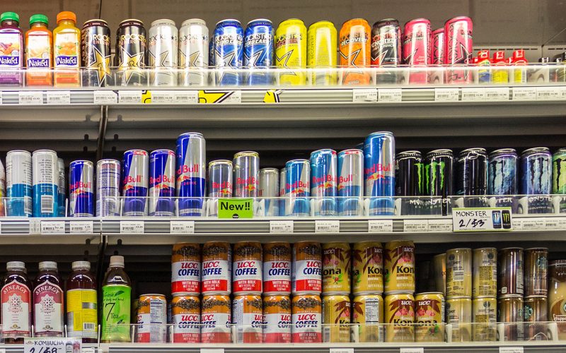
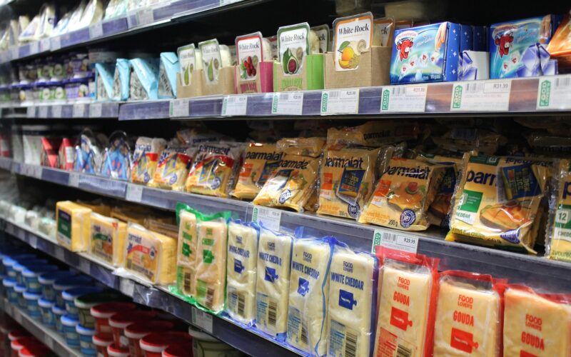
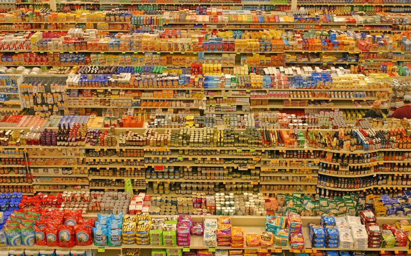
The role of shelf placement and visual hierarchy
Even the most brilliantly designed package can underperform if it is poorly positioned. Eye-level shelving consistently outperforms lower and higher placements, as products at a consumer's natural line of sight receive the most attention. Within the package itself, visual hierarchy — the deliberate ordering of design elements by size, contrast, and placement — guides the eye towards key information. A well-structured design ensures that the most persuasive message lands first.
Familiarity builds trust over time
Consumers tend to gravitate towards packaging that feels familiar. This is partly due to the mere exposure effect — a psychological phenomenon where repeated exposure to a stimulus increases our preference for it. Established brands benefit enormously from this bias, which is why major redesigns carry significant risk. Subtle evolution, rather than wholesale change, tends to preserve brand equity whilst keeping packaging feeling fresh and relevant.
Packaging as a signal of brand values
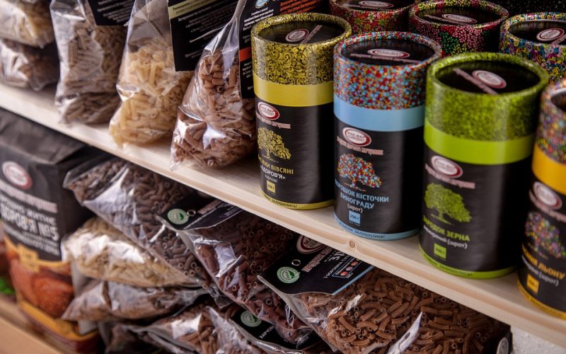
Display packaging has become an increasingly important vehicle for communicating brand identity and values. Minimalist design often signals environmental consciousness and premium quality. Bold, maximalist packaging can suggest playfulness or accessibility. As consumers place greater weight on ethical considerations, sustainable materials and transparent labelling have shifted from nice-to-have features to genuine purchasing criteria. The package, in this sense, is no longer just a container — it is a statement.